together banner
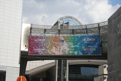
I do try to be positive about the EU, but I find it all exasperating sometimes. This banner is hung outside the European Parliament, celebrating 50 years of the EU.
The problem is that it is utterly unreadable. It looks like technicolour vomit, as though a heavenly hippie has just regurgitated on the wall.
The logo's a problem too. I utterly detest it, and if you look closely you can see that the red letter in it has a white halo effect - a sign of a bad photoshop.
It's absolutely horrid and is on public display at Place Lux where it is frightening small children and disconcerting the after work drunks.


1 comment:
As one of the aforementioned after-work drunks, I can only concur.
Post a Comment